****CLICK HERE TO OPEN THE DASHBOARD****
Dozens of COVID-19 dashboards have emerged over the past three months, allowing us to track the progression of the pandemic from the safety of our homes. Some of them, such as John Hopkins University’s dashboard, have seen widespread usage in news reporting and social media posts and reached almost an iconic status.
So far, however, all well-known dashboards are essentially aggregating data. They are not interpreting data in any way that goes beyond mere data visualization. We at TD Reply asked ourselves: “Wouldn’t it be interesting to apply predictive analytics models to the COVID-19 case data in order look into the future and predict what will happen in the next two or four weeks?” A COVID-19 dashboard powered by predictive analytics could provide, at the minimum, a tangible timeframe to understand when COVID-19 will begin to flatten, which could then be investigated further.
Moreover, we believe that predictive models will play a key role in making better political and business-related strategic decisions. Yet currently, there is a limited exchange between predictive analytics experts from different businesses, academic and other institutions. In fact, many experts are hesitant to publish their models as they are not confident about accuracy. But there is no expert exchange to make predictive models better. We believe that creating and sharing a COVID-19 dashboard with predictive capabilities helps to contribute to an expert discourse on the role of predictive models today and beyond.
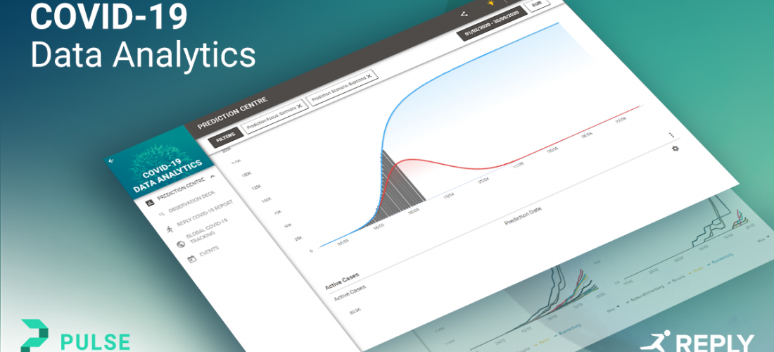
We are proud of presenting the result, 100% home office created using Pulse, our flexible dashboard builder: the COVID-19 Data Analytics (CDA) dashboard.
****CLICK HERE TO OPEN THE DASHBOARD****
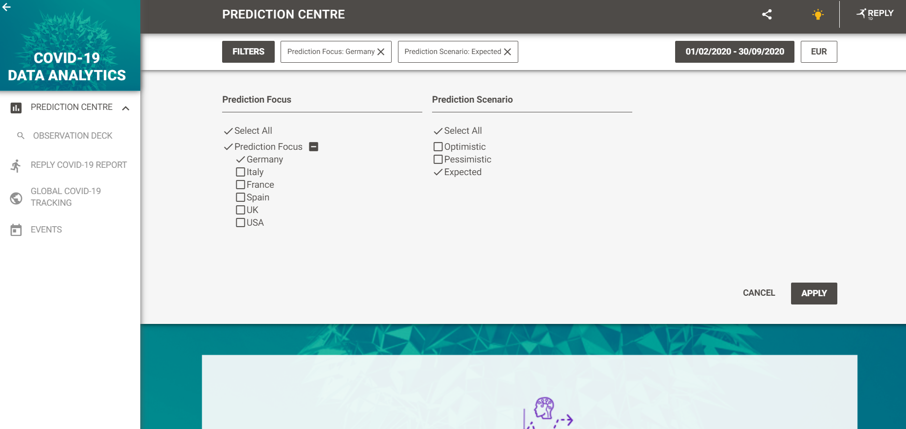
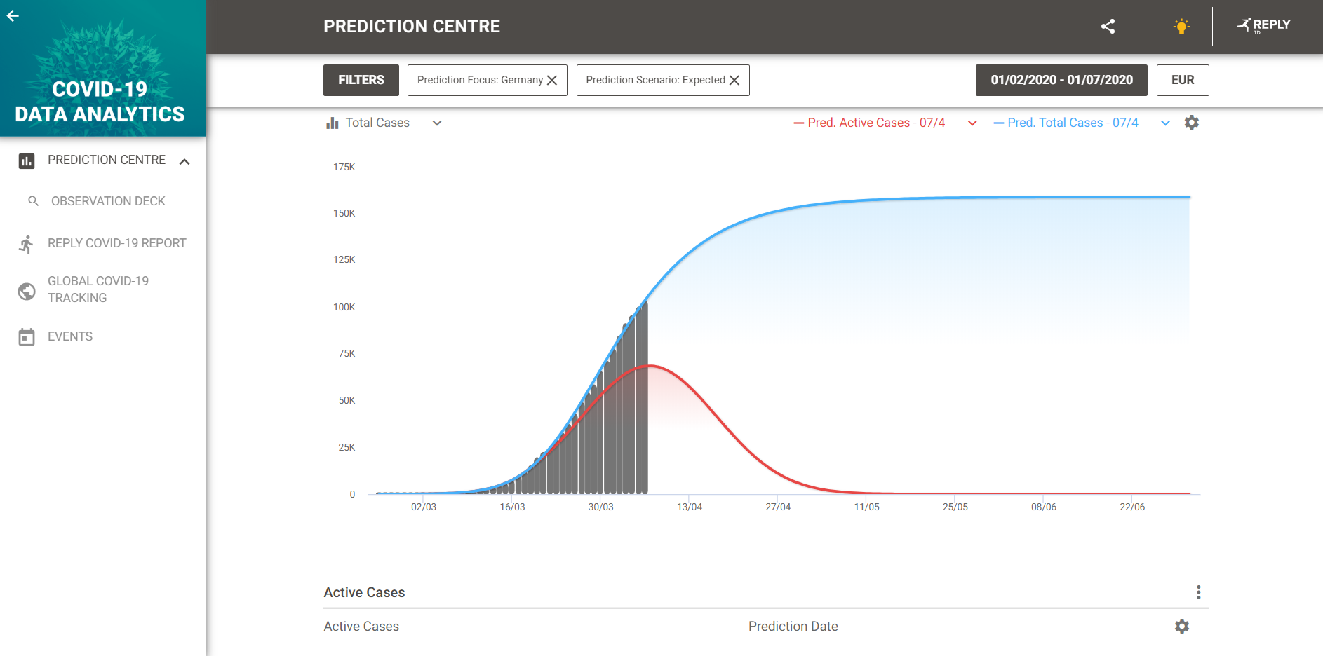
COVID-19 case data by the WHO and the leading German institute for disease control and prevention, the Robert Koch Insitute has been used as the main data source. On the model side, our data scientists have used models from the exponential family based on SIRS models. Additional extrapolations account for important events. The dashboard supports predictions for six countries: France, Germany, Italy, Spain, the UK and the US.
Getting started with the dashboard is easy and you will find additional information within the dashboard itself.
The most important first step is to set the filters according to your own preferences. Here you have the choice between countries and three model scenarios: optimistic, pessimistic, and expected. The latter model is selected by default and represents a middle ground between optimistic and pessimistic scenarios that has, so far, provided accurate results.