
Creating reports is typically one of the least favorite tasks for data-driven consultants and anyone working with an analytics dashboard on a daily basis The process tends to be time-consuming, tedious and prone to errors.
Users of the TD Reply Pulse dashboard, however, are better off: Pulse allows them to create ready-to-send PowerPoint reports in less than 5 minutes! Let us introduce: The Pulse PPT Export feature.
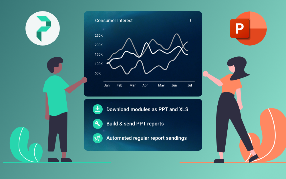
How It Works
Preparing a morning coffee is probably more complicated than creating a report with Pulse (especially for the miserable non-morning people among us). Basically, you select the data to be “reportified,” and voilá, here comes your neat, pre-formatted PPT.

One great thing about the way this feature works and which sets its apart from the competition is that the created PPT reports contain all the raw data from the dashboard modules. This means that users can easily extract the raw XLS data from the report in case of need, or modify it in a convenient way for visualization and presentation purposes.
Of course, it is also possible to schedule the report send-out, with a high degree of customization. You can choose exactly what data particular recipients will receive in their inbox and when, as well as set custom intervals. No uncertainties.
There are countless of uses for this feature, including campaign reporting purposes. Amassing dozens of screenshots of dashboard visualizations to copy-paste into a PPT was yesterday. The PPT Export feature saves time and reduces annoyance. Data-driven analysts, consultants and research gain more time to do something more interesting.
Learn more about Pulse on its official website!
BACK TO ALL ARTICLES